
Identifying Trend Structures on Historical Charts
Master the fundamentals of spotting uptrends, downtrends, and sideways movements. Real chart examples from UK and international markets included.


Why Trend Identification Matters
Learning to spot trends on historical charts is the foundation of technical analysis. It's not complicated once you understand the basic patterns. Most traders spend weeks learning what you'll grasp in one good session.
A trend is simply the direction price is moving over time. But here's the thing — recognizing whether that movement is genuinely a trend or just temporary noise separates successful traders from frustrated ones. We'll walk through the three main trend types and show you exactly what to look for.

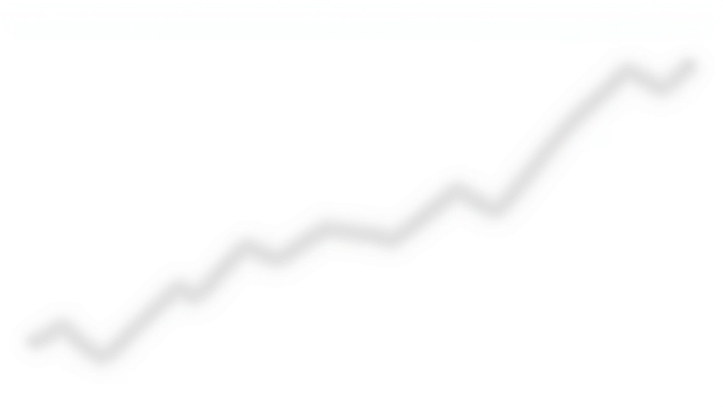
Uptrends: The Pattern of Higher Highs
An uptrend is when price consistently reaches higher peaks and doesn't fall below its previous low. That's it. You're looking for a staircase pattern moving upward.
In real trading, uptrends on the FTSE 100 or EURUSD pairs show themselves through a clear sequence: the price bounces up, pulls back slightly, then bounces higher still. The pullbacks stay above the previous support level. This is what traders call "higher lows" — each dip doesn't go as low as the previous dip.
We've tracked uptrends lasting anywhere from 3 weeks to 18 months depending on the timeframe you're watching. On daily charts, a 6-week uptrend is common. On weekly charts, you'll see trends spanning multiple months.
The Quick Rule: If each new peak is higher than the last peak, AND each pullback stops above the previous low — you've got an uptrend.

Downtrends: The Pattern of Lower Lows
Downtrends work in reverse. Price makes lower peaks and doesn't climb back above the previous high. You're watching for lower highs and lower lows — that descending staircase pattern.
In downtrends, each bounce upward fails to reach the previous peak. That's your signal. The price rallies briefly, then drops further. Most downtrends you'll see on GBP pairs or commodity charts show this pattern clearly within 4-12 weeks on daily timeframes.
Downtrends are particularly important because they move faster than uptrends. Price tends to drop quicker than it rises — this is psychology at work. Fear sells faster than greed buys.
The Quick Rule: If each new low is lower than the last low, AND each bounce fails to exceed the previous high — you've got a downtrend.
Educational Information
This article provides educational information about technical analysis and chart pattern recognition. It's designed to help you understand how trends are identified and structured on historical data. These concepts aren't investment advice, and they don't guarantee any specific market outcomes. Every trader's situation is different, and market conditions change constantly. Always conduct your own research and consider speaking with a qualified financial advisor before making any trading decisions.
Sideways Trends: The Consolidation Zone
Not everything moves up or down. Sideways trends — also called consolidation or ranging — happen when price bounces between two levels repeatedly. The high point and low point stay roughly the same over multiple periods.
You'll spot these on charts as price hitting a ceiling (resistance), bouncing down to a floor (support), then rising back up to that ceiling. It repeats. Sideways trends can last weeks or even months. They're actually incredibly valuable because they show where traders collectively believe price should be.
On the FTSE 100, you'll often see 3-5 week consolidation phases before a major move. Recognizing these matters because they're often the setup before an explosive uptrend or downtrend begins. The longer price stays compressed, the bigger the eventual breakout tends to be.
Sideways movements aren't "boring" — they're where the real technical setup happens. Professional traders often use these phases to prepare for the next directional move.

Continue Your Learning


Putting It All Together
Identifying trend structures doesn't require complex calculations or secret indicators. You're simply observing whether price is making higher highs (uptrend), lower lows (downtrend), or bouncing between fixed levels (sideways). That's the foundation.
1
Look at the Peaks
Are new peaks higher, lower, or at the same level as previous peaks?
2
Check the Troughs
Are the valleys (lows) higher, lower, or staying consistent?
3
Name Your Trend
Based on your answers, you've identified an uptrend, downtrend, or sideways pattern.
Practice this on real charts — especially the FTSE 100, EUR/GBP, and Oil. You'll start seeing these patterns everywhere. Within a few weeks of reviewing historical data, you'll spot trends almost instantly. That's when your chart reading truly clicks.
Ready to apply these concepts? Start with a demo account and identify trends on actual market data.
Explore Demo Accounts